Introduction
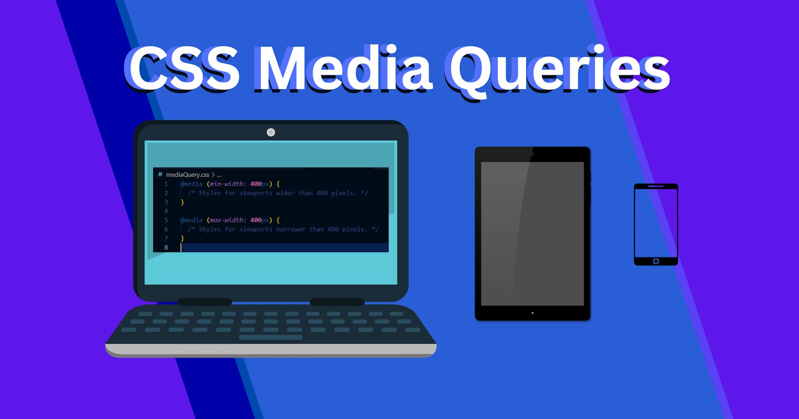
In today's diverse digital landscape, creating a web experience that adapts seamlessly to a variety of devices and screen sizes is essential. CSS Media Queries provide a powerful toolset for achieving responsive web design. In this article, we'll explore what CSS Media Queries are, how they work, and why they are indispensable for crafting websites that look and function well across different devices.
Understanding CSS Media Queries
CSS Media Queries are a set of rules that allow you to apply specific styles to a web page based on the characteristics of the device or viewport it is being viewed on. These characteristics can include screen width, height, device orientation, resolution, and more.
Media Queries are written using the @media rule in CSS and are typically included within your website's stylesheet. They consist of two main parts:
Media Type: Specifies the type of media the query targets, such as
screenfor computer screens,printfor printers, orallfor all media types.Media Features: Define the conditions under which the styles should be applied. Common media features include
max-width,min-width,orientation,max-device-width, andmin-resolution, among others.
How CSS Media Queries Work
CSS Media Queries works by evaluating the specified media features against the device's characteristics. If the conditions set in the media query are met, the styles inside the query are applied; otherwise, they are ignored.
For example, here's a simple media query that applies a different background colour when the screen width is less than or equal to 600 pixels:
@media screen and (max-width: 600px) {
  body {
    background-color: lightblue;
  }
}
In this case, when the screen width is 600 pixels or less, the background colour of the body element will change to light blue.
Why CSS Media Queries Are Important
Responsive Design: CSS Media Queries are the backbone of responsive web design. They enable your website to adapt fluidly to various screen sizes, ensuring a consistent and user-friendly experience on desktops, laptops, tablets, and mobile devices.
Improved User Experience: By tailoring content and layouts based on device characteristics, you can enhance the user experience. For instance, you can optimize font sizes and navigation menus for smaller screens, making it easier for users to interact with your site.
SEO Benefits: Search engines prioritize mobile-friendly websites in search results. Implementing responsive design through media queries can boost your site's search engine ranking.
Future-Proofing: As new devices and screen sizes emerge, CSS Media Queries allow your website to remain adaptable without requiring a complete redesign.
CSS Media Queries are a fundamental tool in the web designer's toolkit, enabling the creation of responsive and user-friendly websites. By using media queries effectively, you can ensure that your web content looks great and functions optimally across a diverse range of devices. Whether you're building a new website or improving an existing one, understanding and implementing CSS Media Queries is a crucial step toward a more accessible and responsive online presence.
